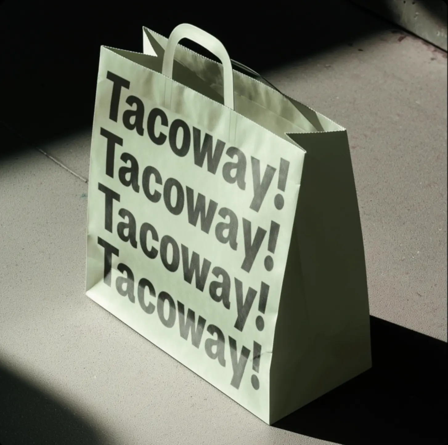
Tacoway Sans
A heavy, bold sans-serif with a retro grotesque feel, think 1970s editorial packaging energy. It leans slightly italic, has tight letterspacing, and a classic double-story lowercase "a" that gives it typographic credibility. Loud and punchy by design, it's built for big display sizes where it can really make an impact.